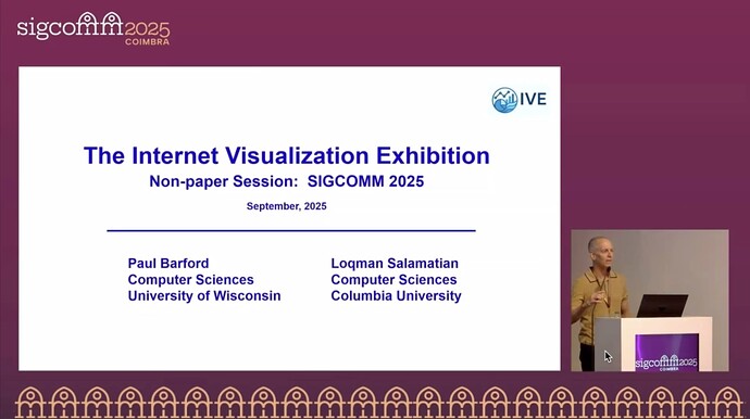
Title: The Internet Visualization Exhibition
Hosts: Paul Barford (University of Wisconsin-Madison), Loqman Salamatian (Columbia University)
Scribe: Mengrui Zhang (Xiamen University)
Introduction
This non-paper session introduced the Internet Visualization Exhibition (IVE), a new initiative to recognize and celebrate creative approaches to visualizing Internet data, systems, and protocols. The session emphasized the importance of visual thinking in networking research—how compelling visualizations can not only simplify complex concepts but also inspire new lines of inquiry. By showcasing historical examples and contemporary community submissions, the organizers aimed to foster a culture around visualization in the SIGCOMM community and beyond.
Session Summary
The session began with Paul Barford highlighting famous visualizations from different disciplines, such as Menard’s depiction of Napoleon’s march, the DNA double helix, and National Geographic’s cosmic evolution timeline, to illustrate the power of visuals in conveying complex ideas. He then moved to Internet-related visualizations, tracing their evolution from ASCII diagrams in RFC 001, to Van Jacobson’s TCP self-clocking illustration, protocol exchange diagrams widely used in teaching, Vern Paxson’s traffic graphs, and CAIDA’s AS-level topology maps. These examples showed how visualizations have shaped both understanding and research directions in networking.
Barford also shared his personal journey, recalling how Walter Willinger’s self-similarity graphs sparked his own interest in measurement, and how his team’s efforts to map Internet infrastructure led to highly influential but largely visual outputs, such as the U.S. long-haul Internet map (SIGCOMM 2015) and the global IGDB map (IMC 2022). His reflections underscored how visualizations can resonate strongly with both research and public audiences, even when theoretical novelty is limited.
The core of the exhibition featured 20 community submissions, spanning static images, animations, and interactive tools. Highlights included Cloudflare Radar (global Internet traffic and security trends), Nautilus (mapping traceroutes to submarine cables), and IODA (Internet outage detection and analysis). The ISOC-sponsored award for “Best Visualization” went to Speedtest Heartbeat for its creative and impactful design. The session closed with open questions: How can we broaden visualizations beyond geographic and topological maps? How can static and animated formats complement each other in research? And how can we encourage more visualization of systems and protocols?
Personal Thoughts
I found this session inspiring because it highlighted an often-overlooked aspect of networking research: how we present our findings visually. The examples showed that a well-designed figure can not only communicate information clearly but also spark new research directions.
The open questions raised at the end also resonated with me. Animations are attractive, but since research papers primarily use static figures, balancing these two modes is important. Overall, I believe the Internet Visualization Exhibition is a valuable step toward building a stronger community around visual thinking in networking research.
